Red Bird Remodeling
Red Bird Remodeling evolved from an earlier business called Cardinal Carpet Care. As the company grew, the type of work changed to mostly home-improvement projects. Red Bird was born from those renovations and so the branding had to be elevated to something fresh and on point. Since Red Bird’s inception, their projects have become larger and more complex and they have moved into the realm of restoration of historic properties. For Red Bird’s brand, a one-of-a-kind font was created. It is paired with a sturdy slab serif font, to communicate stability and the red bird becomes integrated into the design by occupying the negative space of the R.
The Entrepreneur’s Toolkit

The Entrepreneur’s Toolkit was a workshop developed to help small business owners with some basic skills for running a small business, such as maximizing profits, organization, productivity and more. The branding for the event stemmed from its parent-company brand, but it needed to have its own personality, so the same colors and fonts were utilized, but the look and feel was something completely new. The event was promoted through social media, such as LinkedIn and Instagram, so the posts had to fit within the brand across all channels. Below is a variety of posts for the event.
Second Story
The branding for Second Story was designed around the concepts of luxury, simplicity, and the unexpected. In discussions with the company’s owners, the idea of elevating design was a recurring theme, thus inspiring the ascending S pattern, which also reinforced the double entendre of “Second Story”. Navy blue was combined with citron green and silver to create an elegant, yet electrifying, palette.
Well, Well, Well

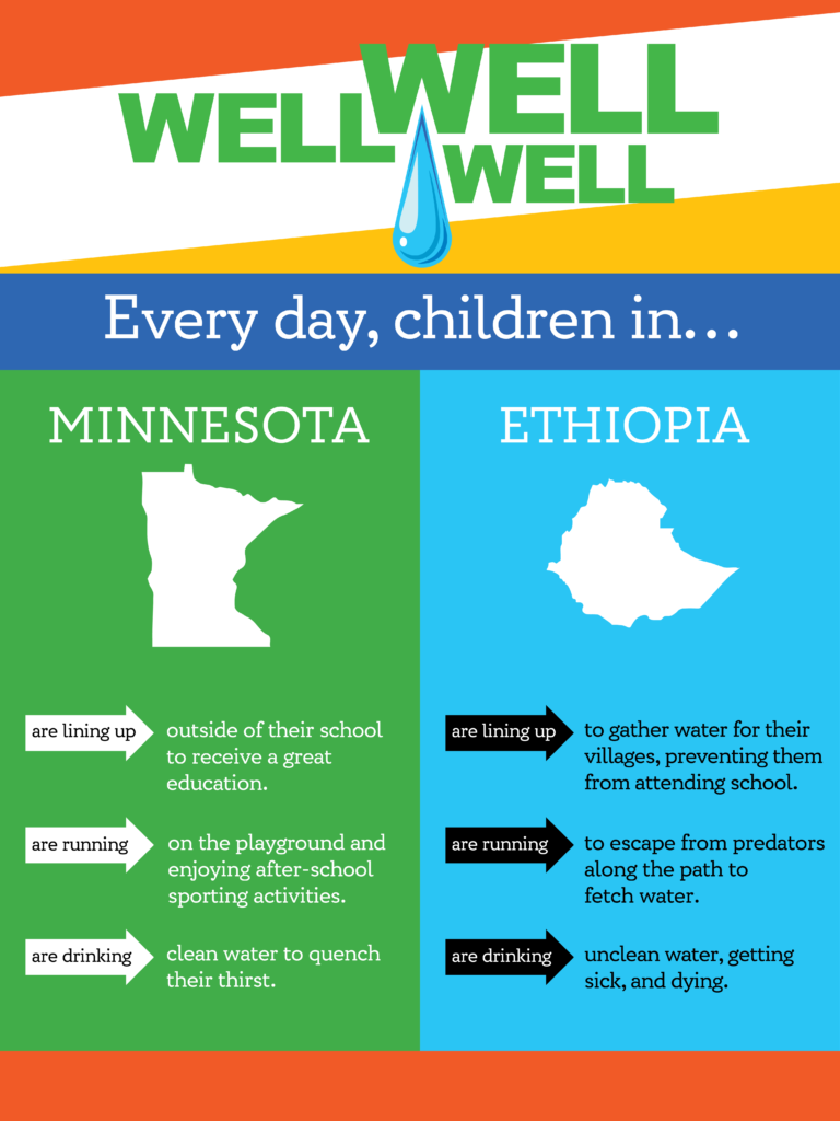
Well, Well, Well was an event in Minnesota to raise awareness and funds for a clean water initiative in Ethiopia. Nicolo Studio created the logo and posters for the event.


Art Packs
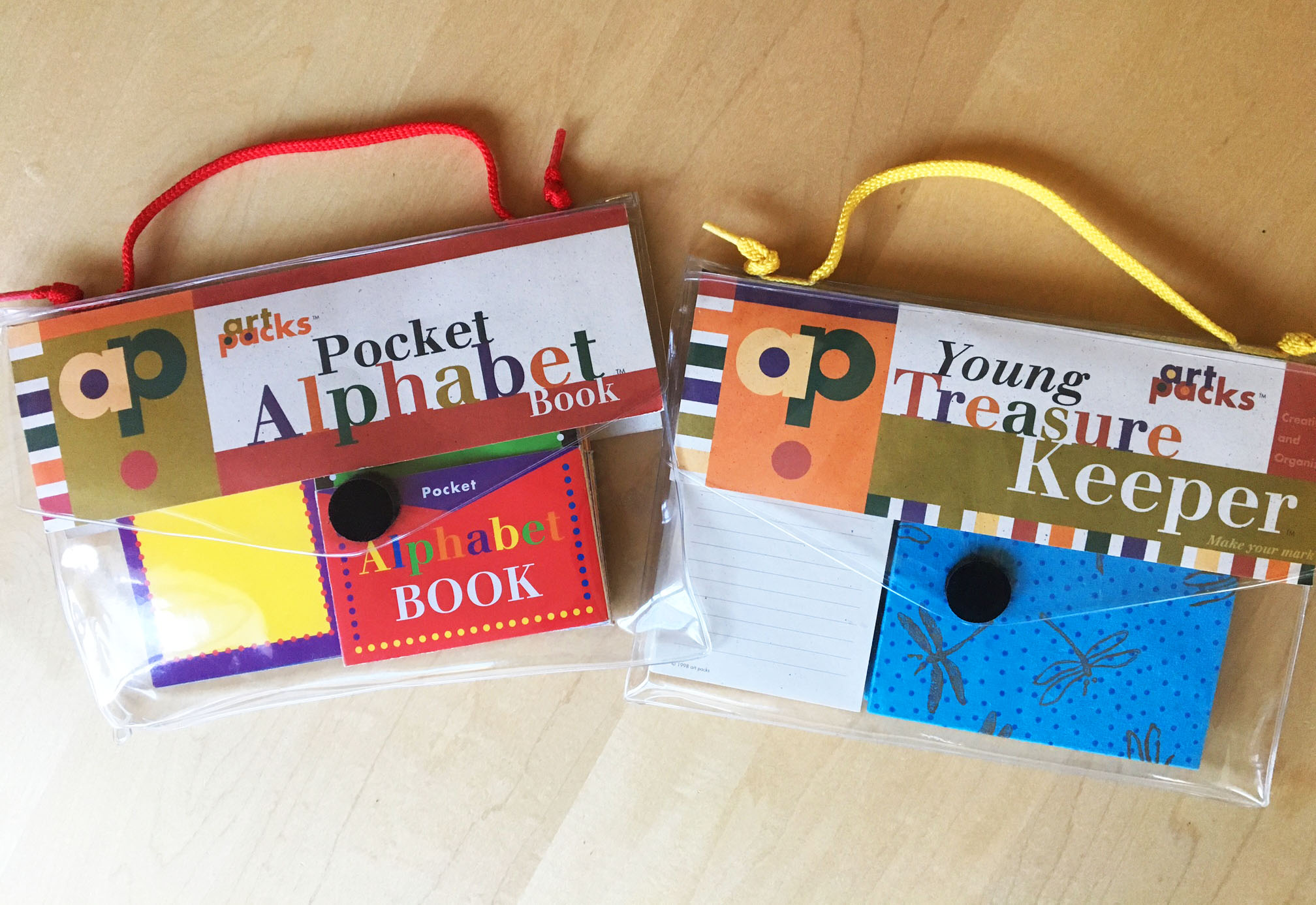
The branding of Art Packs was a collaboration between partners, Barbara Beshoar McIlrath and Jane Nicolo. This extensive project was for a small company that created handmade accordion books, with pocket pages. The products were designed to inspire creativity and were sold at regional gift shops. When Art Packs approached Beshoar Nicolo Studio, the company had been operating for several years, but planned to expand, so it needed logo and packaging design, but it was also looking for help in designing some of its product line.
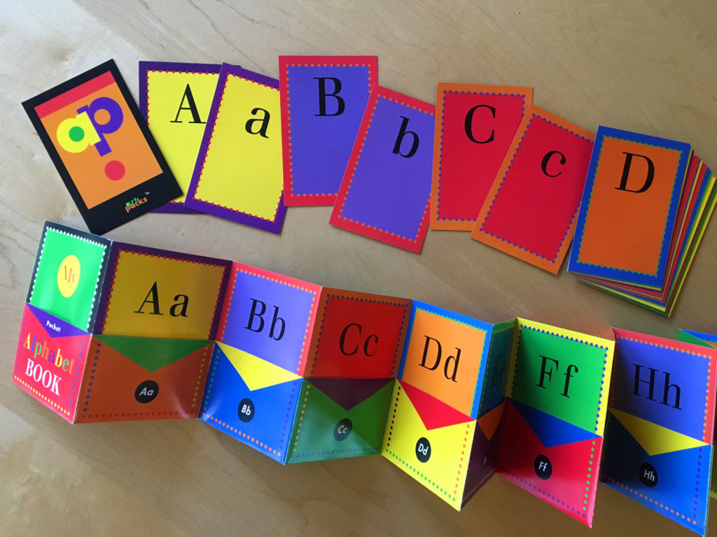
From the very beginning of the project, it was clear that the main objective for the Art Packs brand was to develop a visual system that communicated creativity and fun. The logo was comprised of the initials of the company and expressed individuality. A flexible and vibrant color palette for the brand was established very early on in the process, so that the brand and its components could exist in a number of different variations. Once these things were established, this system could be easily adapted and applied to products, packaging, labels, and administrative materials.
Craig Bares Photography
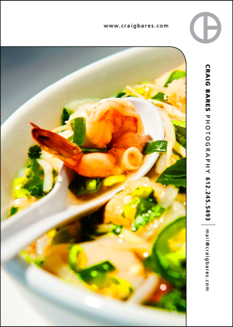
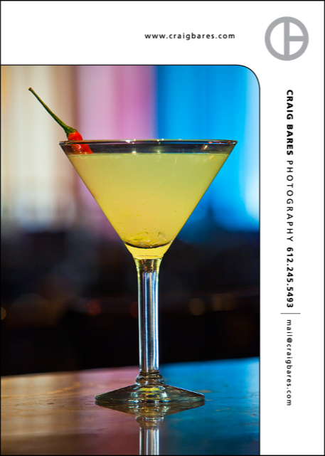
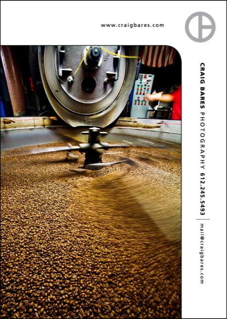
Branding for Craig Bares Photography is minimal, yet effective. The mark, itself, incorporates Craig Bares’s initials, as well as a circle, representing the lens. Nicolo Studio incorporated the brand in a marketing piece template, that worked vertically and horizontally, allowing it to merely play a supporting role, while the imagery gets to be the main attraction .



St. Joseph’s School
St. Joseph’s School needed to rebrand the organization as an overall marketing effort to attract new families, after a period of declining enrollment. Nicolo Studio provided the school with a fresh and contemporary look, while maintaining a warm and welcoming presence via a hand-rendered logo.
Fall Fest
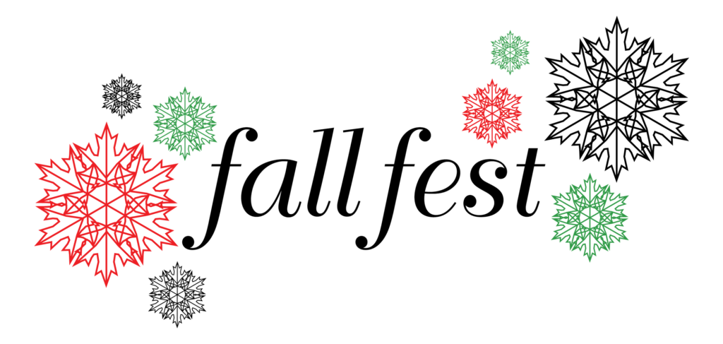
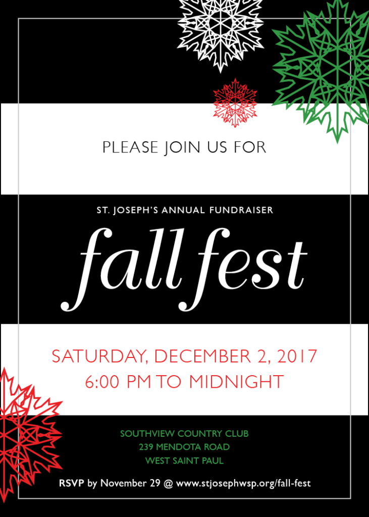
Fall Fest is an annual school fundraiser that has taken place for decades. The branding challenge for this event, which used to take place in late fall, was that the event was moved, in recent years, to the holiday season. A snowflake, comprised of fall leaves, rotated around a central axis point, solves the visual dilemma. In addition to the logo, Nicolo Studio designed all of the correspondence, signage, catalog, menus, digital welcome sign, and Power Point presentation for the event.
FairyTails in the Park
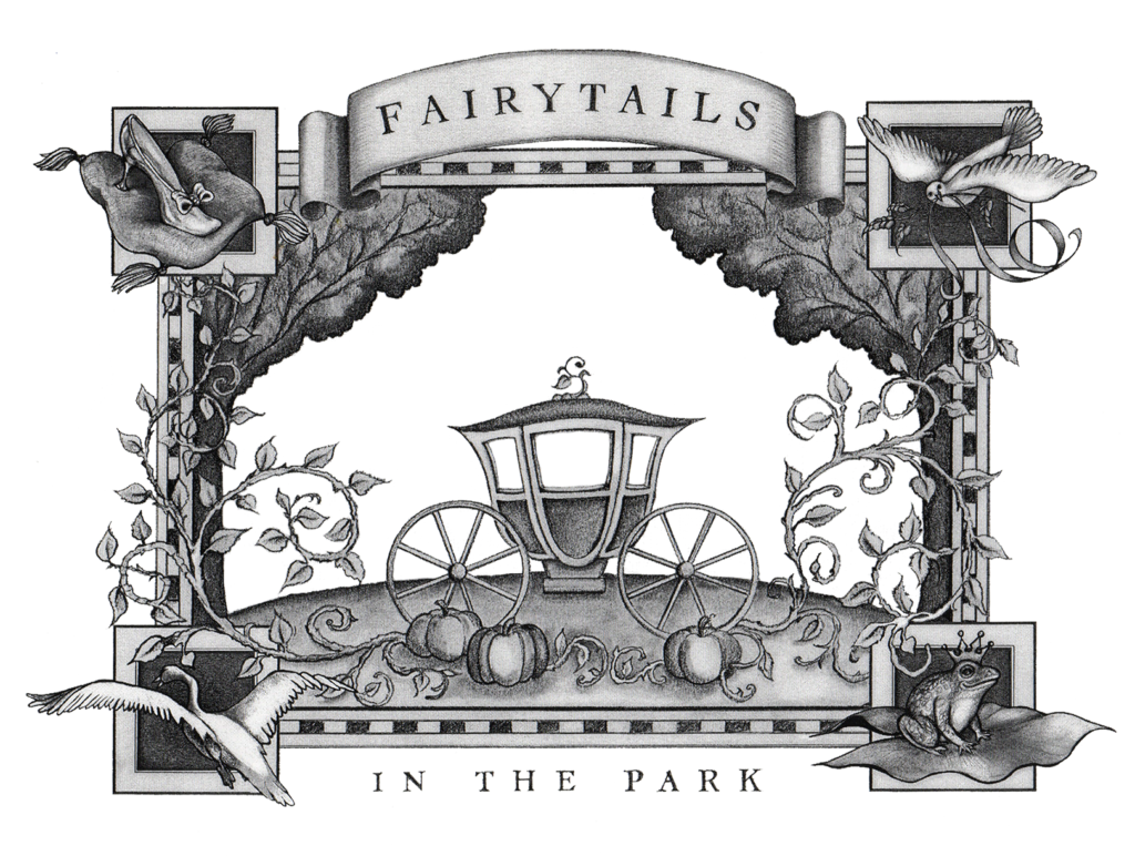
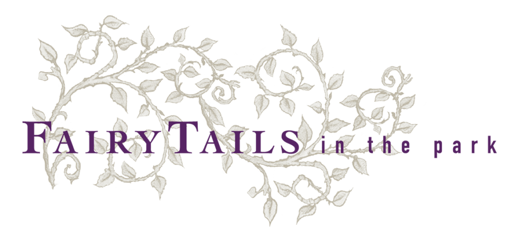
FairyTails in the Park approached partners Barbara Beshoar McIlrath and Jane Nicolo to help with branding for a horse-drawn carriage service in local parks. Beshoar Nicolo Studio created this hand-drawn illustration, inspired by fairy tales and theatre, to set the stage for the whimsical FairyTails brand.
Brown Family Properties

Nicolo Studio did a simple rebrand for Brown Family Properties. The proprietor of the company wanted to insure that the logo communicated that his business was family-owned, not that his properties were strictly for families, therefore it was important to demonstrate this within the logo. A palette of traditional colors was used to subtly speak about the properties themselves–that they were older, more traditional buildings.

